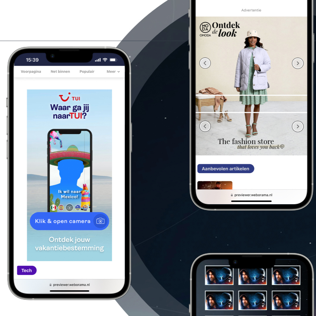
During the 20th SpinAwards (the Dutch award event for digital campaigns) in April this year, the category 'banner' was given a one-time comeback. This renewed recognition of banners as an expression of creative craftsmanship offered us a good moment to reflect on the question: What is the secret of an award-winning banner and how can the banner remain innovative in the future?
This article appeared in Dutch on MarketingFacts.nl
Over the past ten years, the banner has been regularly declared dead. Banner blindness led to lower click rates, blackbox marketplaces had poor viewability and the increasing irritation about poorly applied retargeting or frequency capping of layers did little to improve the banner's reputation. And a banner, isn't that just old-fashioned? So, it seems that banners are being laughed at. Unfairly if you ask me.
In the Netherlands, a quarter of all digital media spend goes to banners (mobile and desktop): this is just under EUR 500 million, according to the Digital Advertising Spend 2017 Report of IAB and Deloitte. Combine that with an average outreach per campaign of over a million and you'll soon realise that this is serious business. It is therefore illogical to take banners less seriously than other digital work.
Yet many creatives don't see banners as the most challenging or sexy discipline, and that's also unfair. Because impactful rich media banners are still a first step in the customer journey. The goal of the campaign makes all the difference: sometimes it turns out that you can achieve a lot with seemingly limited resources - and that a creative banner made spectacular results happen.
The winners of the SpinAwards for banners, Audi and Walibi, devoted a lot of time and attention to the creation. Something that was acknowledged by the output results and the impression the banners made on the jury. What is the secret of an (award-winning) innovative banner? Following the next five steps, I think you can safely say that you can get the best out of a banner.
- Don't let technology limit your creative idea
Work with your technical suppliers to see how you can realise creative concepts without technology being a limitation. Do not see technology as a problem you have to deal with, but as a means by which you can achieve your objectives (ad engagement and conversion) and shape ideas (interaction, design, output). As a creative agency you need to be aware of the latest broadly deployable techniques and it is advised to get regularly informed about the latest developments.
Using WebGL, for example, a 3D effect was simulated in a banner. "Interaction and the ingenious application of 3D, which truly shows technological ingenuity ánd the love for the banner trade. An example of how the banner can remain relevant for the next 20 years", the jury of the SpinAwards said about this banner.
Nathan Coppens, Technology & Innovation Director atDigitas (the agency that developed this technique together with Mr. Ynk): "The Audi 3D banner shows that by means of WebGL linked to user input (cursor movement and scroll), there’s still progress that can be made".
2. Plan ahead
Consult with your media partners if you want to do something innovative. The biggest enemy of good banners is always 'time'. Every advertiser has a long-term plan for the introduction of products and campaigns around them. So try to get involved partners on board at an early stage: media agencies, production, publishers. Planning and strategy, production of assets and technical frameworks and appropriate media space all play an important role in the success of a campaign.
3. Production and optimisation
Continue to communicate well during production and, above all, do not compromise on the idea. Technically, of course, there are limits. But there are always alternatives that come close to the idea. Once the banners are live, it is also important to monitor whether the banners do what you want them to do: do they interact and perform the way you want them to? Creatives can always be fine-tuned during campaigns. Digital isn’t print.
Talking about monitoring: the Walibi Lost Gravity banner, for example, scored well above the benchmark ('layer number of times opened') and provided an uplift of 7% in total revenue.
4. Keep learning
Take learnings from your previous campaign with you to the next one. By continuing to test, creatives are getting better and more important: they will be different every time. Even with the same media buy-ins, there is always room for innovation.
5. Have guts: banners are creativity on display
Digital creativity is largely expressed in an (audio) visual way, which is no different with banners. The most surprising and original creativity takes place outside the safe framework of tried and tested concepts or standard banner specs, and therefore it is the duty of creatives and advertisers to always take up the challenge and pushing the boundaries. It is nice to see that advertisers also make room for this in their budgets and do not always allow themselves to be guided 100 percent by performance or ROI models.
Jaap den Hertog, co-founder and technical director of Men in Green, confirms this. "We notice that the really good scoring campaigns are not only focused on clicks. Display, and certainly rich media expressions, are a perfect way of showing premium content. In the end, it ensures that you can present the core of a brand in full glory.”
The winners of the SpinAwards for banners have showed us that there is enough creativity and innovation to be achieved with a banner. I wonder: isn't it time for the banner category to completely return to the SpinAwards? That banners will become common again in other award ceremonies? The campaigns discussed and their results would not be out of place at the Effie Awards for instance, where effective advertising and marketing communication is celebrated.
After all, you don't have to reinvent the banner. It's about constantly surprising people in the right way.


