Over the past period, we have been working hard to improve the Previewer, and we are pleased to announce that the new and improved version is now available! The Previewer has undergone a thorough transformation and now offers several new features.
What has changed on the backend?
Our initial commitment was to make the procedure between previewer and live as tight as possible, but in this we made certain decisions that made the previewer unnecessarily slow after a large number of users and creatives were active. We centralised all data and made it more efficient. The new previewer works a lot more stable and faster in all areas.
What has changed on the front end?
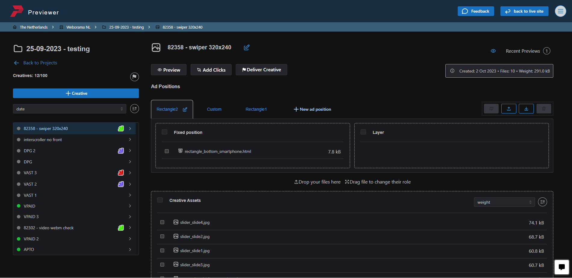
• A whole new look and feel with a new logo and favicon. Much of the code has been completely rewritten and a lot more stable and efficient.
• To give the eyes some rest, we have added a dark mode.
• Webo Chatbot: an add-on to automate certain queries and direct you to useful links.
• You can now sort your projects by: name, creator, number of creatives and date.
• Mark creatives with a colour: Colour tags can now also be added from the creative page, previously this could only be done in the projects overview.
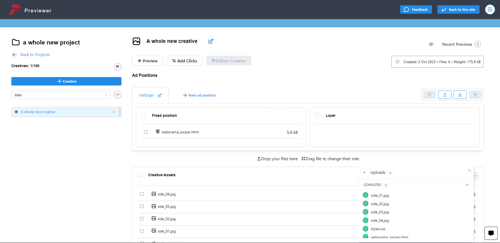
• Upload feedback; after uploading, you will see at the bottom right whether certain files have been skipped, due to naming or other issues.
• You will now see a warning 's icon for files over 4mb
• Drag & drop of files has been improved
Do you have questions about the new Previewer? Contact us for more information.
