Swipe, scratch, open, close, scroll, choose! Rich Media lends itself perfectly to these actions, but does the user actually engage in the interaction? What makes users embrace one form of play and ignore the other?
Using our own data, we attempt to retrieve the answer in this article. Herein, the focus lays on creations which implemented a game form, ‘gamification’, in other words. Logically, we worked with actual impressions and ignored auto-interactions. To uncover how to implement gamification successfully, it is advisable to start at the beginning. Namely, in what phase does a gamification banner fit?
The touch phase
Interactive, eye-catching, Rich Media formats go hand in hand with the first layer of a marketing strategy; the touch phase. This phase targets a broad audience with the goal of increasing brand awareness and brand preference. This goal is achieved (in part) by gaining the user's attention.
One way of capturing attention is to add gamification to the banner. While a static banner only transmits information, a gamification banner involves the user. The question remains whether users engage in the game or whether it simply blows past.
"An online activation that incorporates a good storyline, reward structure and playful experience can greatly lift engagement and conversion (Emerce 2021)."
Creation makes the difference
Our data shows that while a portion of users certainly engage with the game, creation makes the difference. The biggest factor between a successful and less successful gamification banner is clarity. Many users are not used to being able to interact with a banner or brand. This aside, placement and visibility play a big role as well. Game forms in small formats at the bottom of the page often fly past the user.
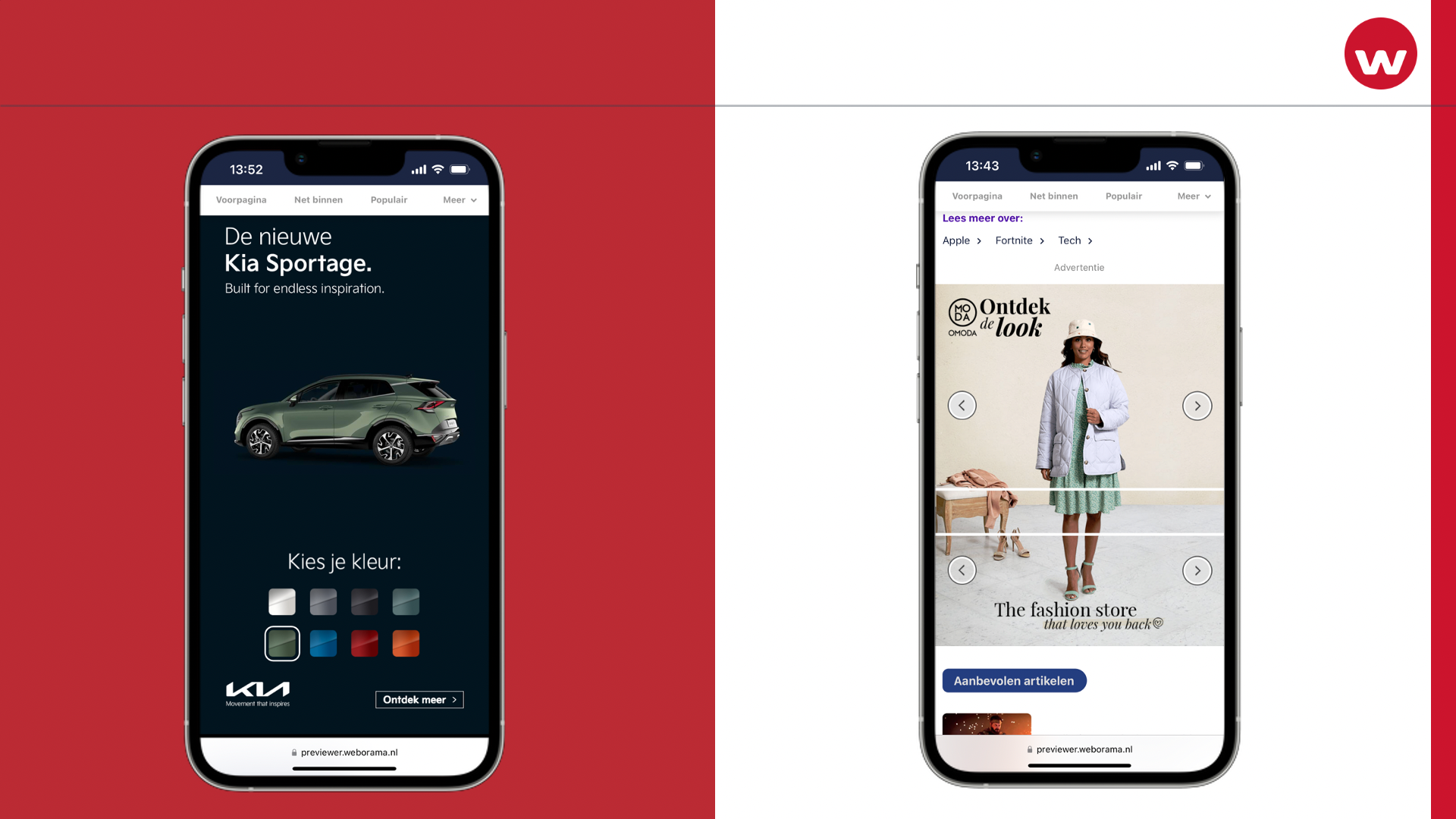
Successful gamification creatives are highly visible and simplify the game form without losing attractiveness. Below you will find two very successful examples from Kia and Omoda.

My 84-year-old grandmother-in-law understands what must happen here; 'Oh so I can choose colors here, how witty'. By combining a strong call to action with a clear attractive game form, it is immediately clear to users that this is not a static banner.
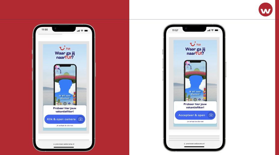
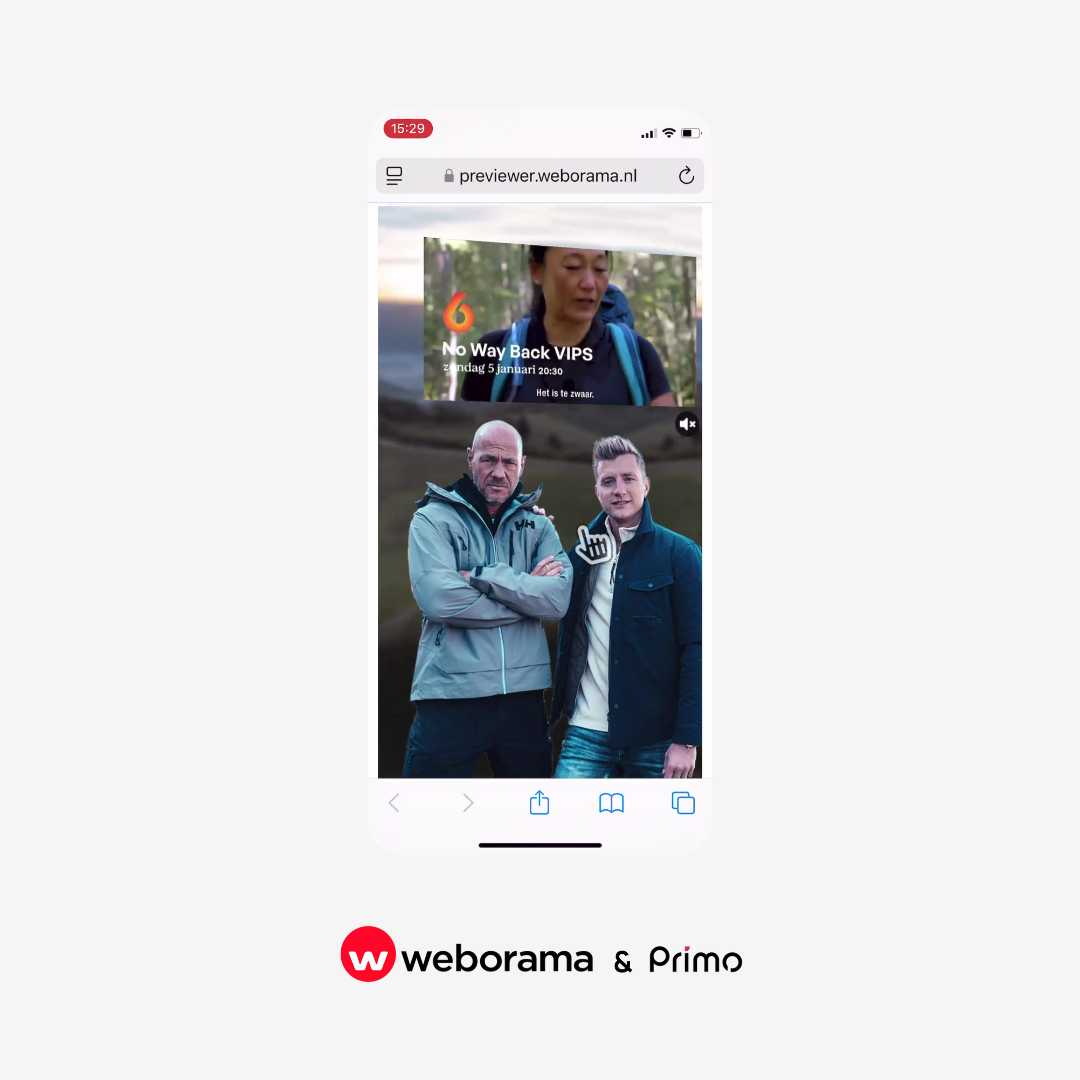
Thus, find out; does a general user understand what needs to be done? If you have doubts, demonstrate to the interaction to the user first by using an auto-interaction. For example; incorporate a nudge, a moving hand or a pulse in the creative which demonstrating the process. In addition, test different call to actions to find out which one complements the creative best. For instance, the left TUI AR banner below had three times as many AR starts, while only the copy differed slightly.

In short, we see that users are quite willing to interact with the creation provided the gameplay is simple, attractive and clear. In addition, you test which message best completes the creation. Every situation, campaign, target group and advertiser requires a different approach.
If you can't work it out yourself, let our sales team think along at sales@weborama.nl. Finally, for inspiration, you can always have a look at the interactive category on the Weboshowcase.


